Friday 3rd November 2023
L/O: to develop the language of media analysis
Album cover cultural knowledge
Country ik its pop
teens/older women dince the cover is bright and chaotic for older viewers
powerful, comfortable, in need of love due to the bright pink/ red colours. `her screaming could imply she is desperate, stars connote how she is god like.
she is in relaxed position country has certain outfit and birds
e
The unity of the parent and son show how the music is about love and parent-ship since typically being in the centre and the main image presents how that content will be shown. Black and white is traditional and conntes that their relationship has been hard and serious
The fact that she is the bike relates her to motorcycles and being into cars and mechanics. Since bikes are often used to travel, it can connote that she is using it to move around and she doesn't linger in one place for too long- presenting how the music is fast and not slow. The red lips connote love and the fact it is the only colour pronounced can suggest that love is a theme in this cover.
individual and different main gender suggest that some of the a music is diverse and for different people who are loving and for childcare
Semiotics Thursday 9th November 2023
L/O: to understand the terminology and theory needed to analyse music videos
Blocking- character positioning to present who has more power and importance in a scene
Semiotics means content has a denotation and a connotation
still movement, conveys seriousness.
Over the shoulder dirty singles to convey that they are united and both important to the conversation
High angle to sit down, conveys that he has more power than her
Close up to convey his dialogue/ diegetic sound is important( maybe more so than her in the situation since he has more close up)
props too
Lighting- light with green tints but still dull causes some dark themes
Analysis Friday 10th November 2023
L/O: to practise using the terminology and theory needed to analyse music videos
Music video Conventions:
Skeleton make up on their face to be in touch with the dead and non-living
The props, instruments were highly focused on in the band sections to prioritise that they are important and displays the bands best instrument
Various low angles have been used to look up at the stage at the band, making certain that they are the most important. It could also be a symbol of a dark lord with the dark costume and skeleton make up like almost a ritual and the audience are looking up to the devil- the high red lighting as well as the dark lighting being present the whole video definitely gives another indication that they are working alongside evil and the devil as stereotypically those colours represent him and that culture giving an unsettling edge to the video
The green costume is a direct contrast to everyone else in the video, connoting that she may be closer to nature as green commonly has those themes; presenting her as someone to be trustworthy and likeable due to the bright colour scheme of her clothes and corridors that she is in..( the absence of red and better lighting connotes that she could be more heavenly like more than the rest of the cast. The close-up of her face and feet at the end may connote that she was important and then no longer important and that only her body is useful after she visited something. The slight pan following her places her as important and vital to the short narrative. The handheld almost shaky camera gives a sense of realism like a real concert, connoting that the song is diverse and fun rather than being boring and still. It also conveys a sense of mystery as we have no clue what is coming next due to he nature being shaky and random, which distinctly tells us that the two settings are highly different. The blocking of the woman puts her in the middle and centre, focusing all of our attention onto her. This gives the watchers indication that she is the lead and that we should have full attention on her rather than the changed lab background setting due to her being tracked by the camera
Representations: Women and men are both represented, however the main lead is a man, which provides extra support and indication that he is the main figure
Intertextual references - skeletons and halloween type vibe, retro style camera quality could be referencing to old shows and casette tapes in the olden days of video
Genre Conventions- Alternative rock with subtle heavy metal references. The focus on the band with short narrative is a key convention
Context- high references to religion and how mary weeps and is included
Blasphemous - could be seen as offensive towards god and religion
Analysis Thursday 16th November 2023
L/O: to practise using the terminology and theory needed to analyse music videos
Gender- women in revealing clothing, but there are more of them.. maybe showing how they surround the man to be used (blocking) as they are all centered around the artist. Stereotypical of how women are used by men and 'traditional' as stereotypically more women were seen as dancers
Sexuality- women dancing vigorously with each other, heterosexual relationship cheating still the main point of the video
Ethnicity- more white than any other race included
The artist is being surrounded by females, the main lead- the ringleader sort of outfit places him in a position of power. He is unique and camera centres on him
Music Videos Friday 17th November 2023
L/O: to research the set texts
Heaven
Will you recognize me
In those flashing lights?
I try to keep my heart beat
But I can't get it right
Will you recognize me
When I'm lying on my back?
Somethings gone inside me
And I can't get it back
Oh heaven, oh heaven
I wake with good intentions
But the day, it always lasts too long
Then I'm gone
Oh heaven, oh heaven
I wake with good intentions
But the day, it always lasts too long
Then I'm gone
Then I'm gone
Then I'm gone
Then I'm gone
Then I'm gone
Then I'm gone
Then I'm gone
Then I'm gone
Will you recognize me
When I'm stealing from a car
You're not gonna like me
I'm nothing like before
Will you recognize me
When I lose another friend
Will you learn to leave me
Or give me one more try again
Oh heaven, oh heaven
I wake with good intentions
But the day, it always lasts too long
Then I'm gone
Oh heaven, oh heaven
I wake with good intentions
But the day, it always lasts too long
Then I'm gone
Then I'm gone
Then I'm gone
Then I'm gone
Then I'm gone
Then I'm gone
Then I'm gone
Then I'm gone
Oh heaven, oh heaven
I wait with good intentions
Oh heaven, oh heaven
I wait with good intentions
Oh heaven, oh heaven
I wait with good intentions
You say that you're away
I try but always break
'Cause the day always lasts too long
Then I'm gone
Then I'm gone
Then I'm gone
Then I'm gone
Then I'm gone
Then I'm gone
Then I'm gone
Then I'm gone
Then I'm gone
Then I'm gone
Then I'm gone
Then I'm gone
Then I'm gone
Then I'm gone
Then I'm gone
R&B / pop hybrid
Heaven- 2012
The meaning is that god or. society wouldn't like them due to their actions based on the way they have been treated- links to drug addictions and how society would shame them but they cant cope with life without it
She is singing throughout the video with peoples faces being shown throughout with a drug dealer at various points, reflection of life in the city.
Drug dealer- blocking and camera with guy in centre and establishing shot giving a single focus on him, high angles and ye level shots create realism and put us on the same level as well as costume being homeless and typical.
She has been represented as powerful and focused on throughout the video through low camera angle and eye level shots as well which pairs her with the rest of the people showcased, like a bond and not a divide
Boy has super powers and is running away from society, mainly the police, with traditional police outfits, boy clothing covered up since its cold/ covering up his true powers. messed up school setting. Close ups basically the entire video to showcase how important the scenes are- namely faces, important props like keys and him opening the door,
He has powers, and wont back down from doing what he needs to survive, at the end where he is stressed and creates a possible blast
artist has been presented as creative, even though he doesn't appear in the video. This is because the narrative is quite fluent and easy to understand from a viewers POV, ensuring that no one is confused. The absence of the artist makes us immersed in the story itself as we are not focused on the people making the video but rather the story tale as a whole
Thursday 23rd November 2023
L/O: to explore the purpose, form and conventions of music videos
Why music videos?
Sell/promote a song
Bring visual elements to support the song
Creates brand identities
Codes and Conventions:
Many close up and mid shots of the artist
Diverse angles, low and high but eye level is mainly used throughout
SFX with filters - yellow and tints of pink/purple - colour grading to make them more smooth like a natural video with the normal black specks like a record label
Street setting and tall landmark setting shown
Props like religious doll
Clothing of artist is usual dark blue with necklace, quite traditional and normal
Thursday 24th November 2023 A List Videos
L/O: to explore the use of media language & conventions in case study videos
old camera with the black spots, a different perspective with the different lighting and looking at the heavens.
Visual aesthetic that was cool at the time, film has a shelf life and degraded and the idea that we don't have a lot of time in our life which links to the idea of fate and the heavens watching over us
She's mostly alone in the frame blocking isolated from the world except near the end with the dude.
she's wearing a saint Christopher on her neck to keep her safe from potential evil, also she's dressed similar to a priest and she doesn't look like a pop artist going against their conventions and something different.
Going down with temptation with the red dress woman and going into hell and the devil
the guy in the tunnel and her looking at him like like she's about to go to him but then turns away and not going into the temptation but thinking about it.
Conventions, rapid and diverse shot types and camera angles
, fast paced, nice beat, artist portrayal as the main character.
Subvert- religious context is not massive in pop songs, her outfit mise-en-scene isn't common with traditional pop stars who were revealing dresses and over the top costumes
Intertextuality- the saint Christopher charm, the Mary statue, the cathedral
Main themes- temptation is the issue- relates to the devil. We see a scene where a girl with a red dress ( connotes danger with the deep red) going down a staircase into pitch black ( we can infer that the black is hell, relates to the black guy at the end, signifying that the devil is temptation and still lurks in society today.
The artist is presented as one of the public, and respected due to the natural eye level angle, as well as also being tempted like the rest of the people in the video. Her priest like outfit almost gives her a holy vibe with her as the role model that everyone, including the best good people can be tempted in the dark evils of the world like addiction etc. She is shown to walk away ( blocking as she appears with a close-up and walks with the guy in the background standing there menacingly)
Thursday 30th November Heaven
L/O: to explore the contexts & representations in the List A videos
the camera angles are always tilted and its eye level for the non artists, we might relate with some of the struggles in life and since they are mainly looking at the camera its more direct but for her its always low angle and rarely eye level to show her power which shows her status. The head being poisitoned away from the camera is a direct contrast to everyone else since they face towards the camera- mmore dissociated from the audience and a higher individual like the priest clothing she is wearing
Low angle shots with sky in the background with high key lighting which relates to being angelic and heaven
Subverts usual female stereotypes - black clothing with contrast blonde hair - more individual
Friday 1st november 2023

- poverty exists with the ragged bag and traditional t-shirt. He is looking up at the sky- which could be seen as the heavens- as well as wearing a cross to so he is in line with god and a good spirit. Typical being sat on the street and standing alongside the wall
- Typical costumes with low quality clothes, sitting on the curb
- There are typical conventions- drug use and alcoholism affects peoples lives and causes poverty with her narrative
- Social isolation- Girl with red dress- with the danger and lust connotations. The blocking positions her in the centre- reinforcing the fact that she is the solo focus. The way she is walking down the stairs puts her further away from society- like a symbol of the devil as traditionally going down to hell and red connotes fiery and devilish connotations. People being by themselves creates a sense of isolation in busy London
- Religion and Faith-The saint Christopher, cross in the woods and cross props have been repeated throughout the video- presents she is christian and believes that is the moral way of life- looking up to the skies and lens flare with Emili Sande being in conjunction with sky and church background
- Kids and Teens -the kids are innocent- the swing prop and facial expressions and blocking (the pair together) presents them as happy. The bike also presents them as creative
- Teens are more rebellious and serious , dissatisfied with their facial expressions and props- smoking with smoke with close up to get a detailed shot to the audience to express that his smoking is vital to notice about how teenagers are acting - rebellious with smoking, being in the dark alleyway. Absence of religious symbols except with angel wing tattoo presents how the younger ones are less in touch with their faith and could create a sense of realism that
- Family is presented as united- the kids standing in a row with the garden, however the way they are position with blocking creates spacial distancing- the two parents with babies connotes how they are loving and motherly, but also since they are alone, the family could be broken and signifies how single mothers are coping well and still out there
- London is shown as realistic with the gritty streets and buses and trains with street life being busy and they struggling - not just lights and rushing.
Representation question

All the representations of the music video creates an atmosphere of realism in 'Heaven' , presenting Emeli Sande as realistic and representative of those who come from lower economical backgrounds.
First poverty has been presented in various ways, one way including a central man with a typical blue ragged shopping back and a basic t-shirt. The costume and prop convey a sense of realism and connote that his money is limited as typically people with more money dress neater and less shabby. Another is those sitting on the floor, alone . The blocking used within these frames position these people by themselves - their struggles are isolated. The fact that these social class groups have been represented lets the audience know that Emeli Sande recognises poverty in London and that she sees the struggle that people go through.
Second, family has been represented as united but far apart: The single mothers with their babies have been represented as they have been positioned in the centre- alone again with each other. Their facial expressions as well as the camera being close up ( especially the one where the mother is in the car), gives the audience a sense of detail and recognises how mothers are happy as well as struggling to cope with the potential of mothers being homeless of living in rundown conditions like the street and the car. the display of these social groups once again lets the audience know that Emeli Sande recognises how single mothers have been treated and positions her in a place of sympathy and acknowledges the struggles- presenting her as beng supportive of those people who are in neglected living conditions.
Third, religion has been presented as vital and as a priority for Emeli Sande. The repeated low camera angles to the sky with Emeli Sande being in the frame with religious buildings in the background includes all these religious symbols especially with looking up to the heavens
Thursday 7th December 2023
List B
Linear narratives
Expressionistic
Post modern- referencing that it IS a media text
Ideologies that represent them - value transferring
Chris Hopewell America
- Lyric meaning - decade way before video were released
- References to releasing names of sex offenders in 2000
- Criticism of authority and a warning against group think
- Attack on 'traditional' values by right wing politicians like Donald Trump
- further reference from Yorke tweeting when Trump was elected, interpreted as a bash against trump with lyrcis from his videos
November 15 ISIS terrorist
Xenophobia. - disliking other countries
brexit
Media Language connotes the theme of persecution as the setting has gallows( structure for the noose) as well as the big wood structure which is set alight. Dunking the woman like how they drowned women in witch trials - setting.
Clothes( costumes) and blocking ( all characters in the centre at the beginning ) with a close up at tHE mayor conveys the tradition of his authority and cycle that everyone listens to him - normality .
Rural life is presented as bright and wonderful with colourful tones, however the ending scene where he is burned alive as well as the with stuff convey rural life as separate and not welcoming , fake
Typical narrative structure- traditional
Friday 8th December 2023
Viewpoints and Ideologies ( Burn the Witch)
L/O: to explore the use of ideologies & intertextuality in case study videos
Mayor clothes at the beginning
Dunking stool - aggressive extreme pagan ideology with hanging and wicker man like fire structure
Traditional house and costumes
Juxtaposition of official in his car with villagers doing their jobs - external authority Mirrors how Brexit and immigrants are represented as they are supposed to be different from society
Jobs seem to conform to stereotypical gender roles- male farmer and girl on pole
Traditional band, festitvities and (apparent) maypole connote values of rural britshness an pageantry
Name of the inn - speared boar - link to the lord of the flues where boys made communal decisions and presenting the great evil in humanity.
Mayors pride in the events- contrasts to the mayors shock- song is about following the rules. Audience sympathy played with
The shot of the gallows dressed with flowers makes it more pure and links to nature- juxtaposition
Ironic communal wave when he is dying in the wicker man makes them seem happy of the death -
creates questions
Intertextual references:
Trumpton & Camberwick green Tv series
The Wicker Man (1973) - police inspector about missing girl - sacrificed and sword scene is the same.
Lord of the flies
Hot Fuzz -- model village
Joe reference on apples
workers like migrant workers
Some are expressionless
Trumpton- Donald Trump
Specific characters referenced.
Intertextuality has been referenced effectively as we can link them to their connotations of how society was like during the 1600s. A paganised sense of work life has been used, with the gallows and dunking stool, commonly used during the witch trials, the intertextuality being used to reference how theres a nod to how society today isn't like that but feels like it, with the delicate flower props on the noose structure (gallows) signifying how it is concealing the harmful nature of the deaths in the olden day society and reflecting today as almost like that just covered up without a serious recognition of societies actions and how governments act too rashly and criticising them for their group acrtion
The wicker man film has been referenced with the sword scene with the women tied in the centre as well as the wicker man statue. Both has been used to link into that film and those traditional values that they convey, further representing society as messed up with those feelings. The ideology that communities sacrifice outsiders conveys that immigrants ( heavy topic at the time) were noticed and viewed as bad and wrong in 2016, therefore presenting radio-head as caring due to acknowledging the prejudice against immigrants in society.
Thursday 14th December 2023
L/O: to analyse the use of media language in case study videos
Sound- bird twittering before and end to show that its natural and reality is still the same with death
Denotations:
Setting - mise-en-scene - is rural and traditional so natural lifestyle, outcasts from society linked into nature where it seems to be natural but we can see it get progressively worse with the props like gallows, bloody pie.
Props - mise-en-scene - wicker-man statue is. big, on fire- is used at end to signify the immense death and sacrificial aspect of community and how life now could still be seen as like that. added with low angles and zooming out, it presents its dominant status and how fierce it is seen to be- a warning that even though its impressive, its still evil.
Low Angle vs High angle- Camerawork - where they are looking at the miniature village- presenting the authority and abnormalness, links to hot fuzz with small village- audiences relate and can question whether the superiority conveys a darker message
Wide shot with people surrounding girl with swords- camerawork + Mise-en-scene. They link to the old pagan times where women were though to be witches and represents the patriachal society within those times and harshness. Links to the wicker-man-film with the sword props and skull costume as they make a similiar motion to present to the audience that they are equal and the dark messages are the same with the eerie atmosphere
The flowery gallows - mise-en-scene- they show how unnatural and pretty they are- could convey that in todays society people still act natural but the lethal tendencies are still present- connoting how the corrupt themes like hanging, death and punishment are still relevant to todays societyBurn The witch
Ethnocentrism - shown when they actively burn the imposer and random
Individualism- presents the inspector as a whole entity and different from society
Authoritarianism - following governments rules and order
Heaven
Feminism, gender equality is massively present with Emeli Sande, as well as multiculturalism as a huge range of diversities and cultural aspects are viewed. Individualism is presented as the story focuses on those individuals like Sande who do struggle with everyday life
All music videos have consumerism and capitalism since they are adverts trying to get you to buy it for personal profit
Narrative:
Equilbrium, they are all living 'normally' and an Inspector comes to inspect
Disruption - the Village is. not what it seems
Recognition- he realises that they arent what they seem
attempt to resolve- he gets locked up and now tries to escape being burned
New equilibrium- he is alive and knows about the villages bad reputation
Representation - RadioHead - Left wing, intelligent, against the government
How does radiohead use traditional spositive stereotypes to show xenophobia
Xenophobia is presented with the positive stereotypes of the people in Burn The witch as we seen the happy, vague and non expressionistic facial expressions on the villagers. These represent that they are feeling majorly positive and ae going with the group idea , without a sense of individualism. The group thinking, alongside the neutral expressions with mise-en-scene creates a sense of reality where the villagers don't care about their actions of Xenophobia and that hating and even attempting to kill outsiders is okay and normalised, creating a view that todays society is the same where we dont care about the migrants who are coming in from elsewhere, showcasing how Radiohead do care about them and how we as a community are rude and not welcoming to those in need of help and support.
Stereotypes of street life are massively used in Heaven to create an ideology that all life on the streets are mixed and that their are struggles everyday with positive moments- where the guy with the plastic bag and ragged blue shirt connote how even though he is grateful for god and his place he still is in need and is still poor in contrast to the happy girls on the swing as they are happy and united, creating view that society on street life is represented differently, the high angle having the two in frame on the swing to present how they are happy and grateful
Questions Thursday 11th January 2024
L/O: to explore possible questions and structuring exam style answers
Used scenes from throughout the video
used intertextuality with a clear understanding of the effect
How to answer the question
Intro- music video relation
Context of video, links to question
Select and explain specific evidence from the video that proves your point x3
3. Explain how representations in music videos are chosen to promote the artist. Refer to one video ONLY!!
In Heaven, various people are featured to create a feeling of how everyday struggles impact daily life. Emeli Sande is featured to create her as being one with these feelings, rather than performing in a different location. This is regular of music videos at the 2010s, where the artist is normally placed in the video alongside the content to present how their beliefs and values are the same as the video and songs message; Emeli Sande's being how poverty, drug addiction and family all affect the community and how those everyday people are struggling right now.
First, we see religious iconography throughout the video. Symbols from he
r saint Christopher (or pendant) and the low angles of the cathedrals places these themes alongside Emeli Sande, as they are both present in the scenes. This presents Emeli Sande as being one with religion, supporting it and allowing the audience to understand that their religious believes are okay and real. It can also symbolise hope, and how religion is all about faith and unity with the community, which connotes that the artist is a true human and like the rest of the community.
Various ethnicities, races and age groups are used in the video. Ranging from young kids to the elderly, there is a representation of diverse social groups, presenting Sande as caring and acknowledging everyone due to her being alongside the community. The fact that all these social groups are shown 3 times or more in the video can link Emeli Sande with all of the people and what they do, which helps promote the her as friendly and kind to the community watching, helping people recognise how nice she is to everyone, painting her in a positive aspect alongside these real humans in the music videos.
Gilroys post colonialism is featured as we see Sandes view on how mixed races are both suffering 2with poverty, her view that everyone is under one roof and equally suffering showing how she isnt biased and cares about all communities, which presents to the audience that she cares about everyone
Furthermore, poverty is shown throughout the video as well, allowing us to realise that Sande cares about how poverty impacts our social life and wellbeing. The one man with the torn blue shopping bag and ragged outfit is shown throughout, as well the kids in basic shirts being presented throughput the video as well - these costumes( mise-en-scene) showing how little money they have with the clothes poor quality. Sande chooses to present these people in a good light, however, with the man with the bag holding his arms out in the rain and the children with a high angle on the swing( to show partnership and innocence) which provides us into an insight that people in poverty and who are struggling are kind natured and good willed, allowing us to realise that Sande is presenting herself as acknowledgeable and wanting to help the poor and those in need, which audience members will like and feel grateful for, glad that their social group is noticed and that they are recognised and will get help, signifying the hope that Sande has given which promotes her as kind and thoughtful to those wider communities in real life that are struggling everyday
Paragraph about drug addiction - scene at end and how she is trying to have a better life- social
Maybe unifinished?
Theory Friday 12th January 2024
L/O: to explore including theory in our exam answers
HEAVEN
Semiology - Barthes. Girl with red dress going down to hell, religious iconography , poverty and drug addiction
Levi Strauss- binary opposition temptation. vs resilience with drugs, going down the stairs vs the light sky with camerawork, vs religions
Gauntlett- religious, poverty influences and struggle makes the audience ponder their own vales and believes and how they act upon these messages
Post colonialism- the mixed races are both suffering so then it is not entirely focused on one ethnicity like the zambian english community is featured as well as many others- her buildings are different to their typical style of believes so then it makes certain that races aren't all stereotyped under one religon or certain belief- Sandes view of London and how black lives are affected in relation to everyone else
Radiohead-
Barthes semiology wicker man, bird sounds, the poison, the seesaw props all connote different connotations of the time period and how it is still relevant to todays society like deaths and corruption in the governments (at trump)
Todorov- clear structure - equilibrium, disruption,recognition is difficult, attempt to resolve is him figuring out what to do but getting. burnt. new equilibrium- he is still alive but knows the disfragmanted view of the village
Levi Strauss Structuralism m - the evil corrupted village. vs the nice outsider inspector
postmodernism- referencing the evil within our society with the props and community burning at the end- relates to Barthes semiology and the wicker man being intertextuality - post modern
ADVERTISING THURSDAY 18TH JANUARY 2024
L/O: to understand the purpose of advertising the language used to analyse texts
- red background long red bracelets- colour palette
- Black outfit hair typography is bold and stands out
- Both have connotations of the devil - colour symbolisations
- Angry/ determined facial expressions links to unhappiness and seriousness and hell
- perfume is serious, bold not for the faint heart- like a status
- The layout has the product ontop of the main image- therefore inluding her and aligning her with the product- connotes a theme that these devil and risk taking themes of the women and perfume are mixed.
- Harsh black logo of the brand contrasting with the beautiful gold can connote how even though they made the product, the whole perfume is unique and different to everyone elses- the gold being typically an expensive and bold colour contrasting with dull black, which places status onto this specific brand of perfume
- Minimal serif font so it can be looked upon as sophisticated
- The product placement- centre placement of the bottle on the hand gives a personal feel and skin touch towards the perfume. These elements create a feel of the how the perfume is close to ourselves and the purchaser, like if the customer used it, it would be almost infused with their body like the wrapped beads around her am adding more depth of how the perfume is coiled around her, presenting how the customers will feel one with the perfume and how purchasing it will make them feel enriched with the perfume like she is?
- The red immense fabric background adds connotations of lust and typical danger connotations. This links to the overall message of how her and the perfume are immense and powerful, and not for the faint hearted. It links a messsage to the purchaser that it is almost tempting you to try the perfume and how the red links all connote a sense of daring and how the perfume will add a sense of adventure and a more fascinating lifestyle.
- The red lips on her face- mise-en-scene add an extensive look into the perfume due to red connoting danger, blood and risk. The fact that the perfume is seen to be red, as well as red on her lips and all around her body infuse her with the perfume and how the perfume is connected to the her, like it will be with the consumer, adding an effe ct of daring and how people would be able to feel adventurous and bold whilst using
AIDA-
ATTENTION
INTEREST
DESIRE
ACTION
Attention - unusual milk details - abnormal grabs attention blue vs white contrast stands out
Interest- the text is unique , positive and directed
Desire- people will aspire to have those typically good bodies, want to be like that
Action- people may stay attentive whilst using their milk cartons to perhaps buy more since it sells as the best one.
purpose- to advertise gillette and the razor products
Layout - centre Main image of a man, product in left hand corner with logo name to the right bottom
Typography Mainly white to promote it as pure. Highlight and contrast to the background- Smooth sans serif that is upper case - traditionally masculine
Language- direct address- qualitative adjective describing efficiency of the tool
Close up of the man, make up of the tattoo that creates a feeling that he is rough but also with the group of people who love music- not scared to show of the tattoo. Replaces where a beard/ moustache would stereotypically be so gets our interest high as this tattoo is unique and different. He has no acne spots so make up makes men want to have perfect skin- desire to look good as that
Colour is dark tones- black, whit and his neutral skin tone are the main colour elements to create a dark and even tone withouut the advert so it isnt too negative- balanced
Brand identity- typical gillette logo, product in thee corner reinforces the audience on what they are trying to promote to buy it- typical slogan to thosew who have bought before to reinforce their own values and how it is consistent and reliable
e
Friday 19th January 2023
L/O: to explore techniques for analysing adverts correctly
Analysis structure-
PEEL paragraphing
Macro to Micro

The advert is advertising perfume, from the lynx brand
The overall message is that he has just clicked a button, like clicking one on a fragrance to get the scent of those in the 1930s as shown by the time object in his hand.( props)
the layout of the guy being centered, with the 1930s object closer to the screen- conveying its importance and how being old relates to the scent in the advert
The colour pallette is a bright shade of grey and white with occassional blue and black, which are very bold and neutral colours, conveying that the perfume is meant to be natural
Facial expression- grinning- happy- perfume is good and alike the 1930s
General gist is to fool nostalgic and like your in an old movie- a unique scent that reminds you of the past. The neutral colours have a normal day feel - natural. The slogan lexis- of click - the new fragrance suggests how easy and accessible it its to have that scent on you- the typography - upper case capitals are stereotypically bold and masculine which targets the audience of mainly men.
1) Technical codes- colour palette- yellow and white connote the feeling of bees and honeycomb scent which is traditional themes of honeycomb
Costume- the typically hexagon shape of honeycomb concealing the woman's outfit attracts those women to almost feel like thats what they are wearing and feel enriched with the honeycomb scent(interest) as it is unique and fits the honeycomb theme
The typography- feminine curly font of the body butter attracts the women as adverts do tend to use these writing styles due to the stereotypical view that it is slanted and attractive and beautiful which stereotypically attracts women which will target them and reinforce the values of the body butter and make them feel more attracted to the butter since they will feel like its targeted towards them
Prop of the actual product to reinforce to the consumer of how attractive and nice the product is- makes certain that they know what they are buying and wanting to find it in the shop
2) The makeup and dirt/blood on his face connotes how rough and tough the guy is- connotes how levi jeans can survive tough experiences like him
The typography isn't targeted towards a specific gender as it is natural and not too bold / rough
The colour is black and white so the only red is the levi logo which is noticeable due to being the only colour apparent in the advert showing how anyone who use levi jeans are noticed and can survive anything in the good quality clothing- more attracted to the brand and self idenity with levi
Direct facial expression towards the audience entices them and makes us feel as if we are with him and feel with his rough experiences- the lexis of tough and spirit make us align with him and how all of us are mentally strong due to his piercing gaze and text being positioned close together- our spirit is alike his and tough which makes us like the advert and feel like we can do anything in levis jeans?
3) Colour - black and white primarily to connote seriousness and how he could be anyone due to not being bright and bold which allows us to feel like anyone could have been in that situation due to black and white being the standard and most usual colours?, with undertones of blue and the logo being in colour. Blue can be perceived as positive, as well as being sky blue and at the top of the poster, which is important as we feel like the title is in the skies- but it can also be perceived as how its in he heavens and a joke like the quote suggests. The logo being in colour is useful so we can recognise the brand of the charity and how we can recognise how there is still some positivity in the charity, the positive connotations giving people a hope and nice outlook on the charity and how it is there to support us
The contrast in colour of the quotations contrasts messages directed towards us and how white is standard, formal and traditional whereas blue is meaningful and typically more unique- presenting how the bottom message can be perceived as more important than the blue due to the natural colour and bold capitals- typography
Image choice of a man is different as typically we see women as victims of sexual assault, so having a man includes all genders into one.
DIRT Thursday 25 January 2023
L/O: to reflect and improve on analytical structure and content
The red notes are from today!!!
Representation
L/O: to explore how representations are constructed in advertising
Friday 26th January 2023
CAGEDSClass
Age
Gender
Ethnicity
Disability
Sexuality
CAGEDS
Honeycomb girl
Class- wealthy people who can afford the specialised body butter
Age - young adults big range 20-45
Gender- predominantly female
Ethnicity- slighly tanned, but skin tone not directly shown, so then it could be for any race
Disability- none present
Sexuality - none present
Levis - Class - middle class, levis is expensive, but can be for lower classes who desire these products(he looks rough)
age- teens/ young adults 18-30
Gender- any gender, 'your' direct address
Ethnicity- black and white filter, but can be presumed that the man is white, representing them more
Disability- not present
Sexuality - not present
Hestia- class is anyone, 'together'
Age - adults 20-60
Gender- anyone, sexual assault is typically associated with women, having a male includes everyone
Ethnicity: White male with black and white filter suggests that all races are unique and are represented
Disability- none?
Sexuality - none
EXAM SET TEXTS
e
Analysis & Context Friday 1st February 2024
L/O: to analyse context and media language in in the dove advert
Dove: £ days of looking at real women parent
Beautifully real mp,s
How its real vs fake stars and how good an impression is.
They aim to create a feeling story to advertise the product
River Island:
Range of diversities, disabilities, genders etc
Shelter: Story of how they aim to get everyone a house, heartfelt
Dove:
Overview: Their product is beauty and care products
Beliefs that all their users - mainly women - are unique, real and that they arent alone in the world
- Dove Inner Critic. Find out why women can be their own worst critic… ...
- Ad Makeover. How would we feel if negative body ads gave us compliments instead? ...
- Real Beauty Sketches. ...
- Legacy. ...
- Choose Beautiful. ...
- #NoLikesNeeded. ...
- Be Real Body Image Pledge. ...
- My Beauty My Say.
- representations of women from all backgrounds

Advert: - Campaign details - Beautifully real mums
Part of the real beauty campaign started in 2004 - embracing and celebrating differences
2017 Dove launched real mum campaign to encompass true beliefs and realism of motherhood
To launch a product line in a competitive market where Johnson and Johnson have a majority market share with 63.7% with J&J baby and aveeno baby products
-Empowers women
Unite women's parenthood journeys
- Enable real people to relate to themselves being represented
- Challenge perfect women images and picture perfect babies and youths
Media Language
Anchorage/ Slogan - text linking image to brand - real life- realism of the kitchen setting in everyone
Location - in family kitchen - real and casual in a home, conforms to stereotypes of women in the kitchen
Hashtag at bottom corner linking campaigns together. In a edited more transparent less bold font than the slogan to draw more attention to the brand due to the tyical Z layout and how that you remember the product
wide -Medium shot /costume - deep focus to encompass the whole surroundings- personalises with open bags, fridge open -of the children and mother from the waist up to encompass their clothes and more about their lives ( costume) and how the shirt is bland yellow - suggests working class lifestyle due to the creases and how they aren't rich and how not every mum has to look perfect
Typography - Capital slogan, sans serif is neutral and white with logo- at the top and across, the dove label being small and next to the slogan with script like font - classic
Colour palette - very bright and colourful - bright yellow and white shades and a dark shade on the cabinets and wall - gives a neutral overtone - happiness realistic side of parenthood
Beauty appeal - lovely kitchen- standardised - hair tied back and natural, lipstick less toned make up reinforces raw natural beauty
persuasive language - real repeated twice conveying the reality even further of how you can be beautiful with a family
lifestyle - challenges typical luxurious lifestyle contrasted- facial expressions is caring and concerned and not typical smiling like in the outfits
Motherhood and coping realistically with 3 children. Caring and daily lives with children and how they aren't all perfect and happy all the time ( neutral facial expressions) we also get to experience how ethnicity is represented - Asian involves different cultures with. motherhood all around the world multiculturalism and defies typical white mothers in beauty adverts as there often an under -looked minority Class is working/ middle- creased casual top but nice looking kitchen cabinets and fridge? - positive representation as motherhood and reality is encouraged by the advert. The stereotype of mothers in the kitchen can be viewed as negative and conforming to old traditional views ( location/ context)No male - mother as the primary care giver. Can be negative.
Boys being energetic and the girl is passive stereotypes
Consumerism - advertising
Celebrity culture- challenges as no star vehicle celebrity
Multiculturalism- asian community often underrepresented
Feminism - Supporting women with children and uniting women as mothers. and challenging stereotypes of glamorised women in beauty
Cultural context - underrepresented women from different ethnicities - asian have been represented - they are a minority not often presented in health and beauty products - gradual movement towards equality with realism with mums from a wide range of different cultures and how this advert, along with the beautifully real mums campaign allows us to experience a wide range of real mums and how each life is realistic and not sophisticated in contrast to the glamourised happy, not exhausted mother adverts which set apart ideal and real and how celebrity culture with being perfect body wise and parenting wise was not true at all and that the Dove campaign strove to set apart from those fake believes and showcase the truth of motherhood\
Looking into millenials as they would be the targets of the products and the mothers represented in the adverts
Social context - the belief that single parents are realistic and far more normal than how it was and compared to other adverts of happy families - bringing in stereotypes of mothers being the primary care giver - positive representation of how single parents can cope like the women in the advert - negative representation of how women are presented as the primary care giver.
River island:
Clothing for everyone
They strive to ' We make fashion for real people with real lives, who want to look real good'
AW, meet the models
Representation - star vehicle is Jordan Luce basketball player who has disabilities - wheelchair user
Campaign had all backgrounds, ethnicities and disabilities in fabulous clothes
#Labelsareforclothes
Features people of varying gender, ages ,ethnicity and abilities
Aim to challenge societal and global stereotypes by featuring under and misinterpreted groups
Challenge outdated stereotypes
Promote inclusivity and diversity
To celebrate individuality and not define individuals by their ability or stereotype
Shot type - medium long shot of whole body
Slogan - Smooth moves only - infers that only the quality is accepted - links to wheelchair and smooth clothing
Typeface/ typography - bold white capital sans. serif font - in the middle to make us look directly look at it due to the contrast to red and white - links to River Island logo and links their values and beliefs to the brand
Costume - nice looking casual clothes - golden coat - like royalty and status as a wheelchair user. Flat cap for style - smooth glossy look lining into the slogan and linking components together to convey the appeal of the clothes
Hashtag central and #labelsareforeclothes meaning how they care more about the unique individual rather than the stereotype of the object that they are associated with peoples personalities - links to digital natives and those growing around social media to feel inclusive and post themselves wearing river island and their clothes no matter who they are
Lifestyle - wheelchair users and how they can live happily in good style
Logo- white and joined with the slogan and hashtag to join meaning and the brands values
Context- listing the website underneath links to to digital natives and how websites are used more often. by the newer generation
Location - deep red background in a studio representing desire and passion, life and how he has beat danger as a model
Product - the clothes he is wearing is stylish and appealing - golden is attractive and represents status
Anchorage - ' Smooth' connoting how he is a good person with a good status- smooth being like clean and quality
Composition & layout - centre of the screen of text - makes it central and that viewers will look at it with man in centre as the star and to gaze upon his lifestyle
Colour palette- golden has status implications and luxury , golden is smooth and glossy like the word and relates to his style. Red and romance of Paris and his nature of how men in paris are the romantic givers
Beauty appeal - smiling, 'well looked after teeth' nice quality coat and wheelchair is clean
Persuasive language- ' only' meaning how there is a way of life to feel good and how that is a standard that you want to meet, moving smoothly through life and how he isnt restricted but is coping well with his wheelchair disability - smooth being glossy and sophisticated and how if you be in the same mindset as river island then you will be having a good movement through life
Smooth moves can be inferred like moving in a relationship - french males have connotations of love and deep romantic
Context:
Men and disabilities, athletes, are represented- Unique and positive as disabilities are rarely featured in fashion - marginalised.Athletes too since he was one.Seen as weak and inferior and juxtaposes to the advert where he is seen as superior The stereotypes used are Paris and romantic men being the stereotype in Paris - red background and challenging stereotypical fashion industry and how the campaign involves the disabled community which typically isn't shown. Facial expression is happy and presents how the values of the clothing is good and quality.
Multiculturalism due to him being of colour and from Paris
Media language is background, clothes
Celebrity Culture and endorsement have been dominating fashion and their advertising. The subversion with less mainstream celebrity icons with fashion can be seen as unique and more diverse with a sense of fashion and representation of social groups that aren't focused on mainly - like the disabled community with Jordan Luce being a prime example of this and how the perfect body image has been subverted
Social context - Digital natives and the hashtag - suggesting the target audience to share it with other social platforms - more diversity and equality being spread through the #labelsareforclothes
Ideologies and Values
- Consumerism- Adverts due to promoting clothes for purchase
- Celebrity culture- Jordan Luce - advertising for those interested in his background of basketball
- Ableism- people with disabilities are represented - challenges absent representations of white healthy men - liberal and progressive audience for people who care about the disabled community
- Individualism- Everyone is unique and powerful , separate and all looked upon in the same high status
- Multiculturalism- Those from different ethnic backgrounds are represented - diverse and inclusive for those from any background
Shelter
Shelters aims are to accomodate as much homeless people as they can to prevent poverty and suffering in the world
No place to call home christmas' ad as well as 'hanging on'
Campaign - video of a child's- story, adverts that aree bold and different
The Autumn 2011 total of rough sleeping counts and
estimates in England was 2,181.
• This is up 413 (23%) from the Autumn 2010 total of 1,768.
Media Language:
Shot Type - Big close up - more direct and close to facial feature
Slogan- We can help' possibly all involve pronouns to make it more personal to these people in need and how we are all together in society to help these people
Typeface(typography)- Blocked sans serif capitals are direct, bold and massive
lexis- personal pronouns involving the separate stories and individualising them with the issues surrounding homelessness. The white at the bottom repeating 'We can help' being part of the slogan but repeated to ensure that support is available
Lifestyle- Presented through the lexis of how they are coping with living and issues surrounding homes
Logo - bottom right in red combining elements together represents danger and blood- last thing you see if you follow the 'z' layout to have a lasting impact
Anchorage; red text in middle linking social situation to reality and combining the effects of the white and red text to ensure thorough understanding
Composition and Layout; The red text being in the centre above the face being positioned above and almost hard to read - representing the harsh reality the people are going through - their eyes are all open
Website at the bottom to link with the donation and seeking help with their own situation and in centre too, giving a more personalised expression and direct address to evoke sympathy
Colour palette - the traditional red, white and black - conventional of shelter adverts but red connoting primarily danger and how they are in trouble. White is basic and neutral and black adds a serious edge and dulls down the advert to connote the lifestyle that they are in misery and confused
Persuasive language - rhetorical questions - you/ your being more personal - direct address and question asking how they will cope and persuading us to look more into donating
genre conventions of charity ads - the direct address and making us feel like we need to act upon their lives- the red and black text dulling down and adding a serious note on the advert as well as the personalised pronouns linking a story and personalising their roles
Representation:
A wide variety of people are represented from wide ethnic backgrounds, both genders as well as age being different too. These factors align with each other and comunicate messages that ensure how people from any background, social group etc can be involved and turn out to become in need of direct help since they could be at risk of becoming homeless and ensuring that we are all aware that it very well may happen to your family and friends- subverting the usual stereotype of common stereotype
The representations are negative as it gives us a sense of suffering and how anyone in the world can be in danger and a victim of losing their own home due to their unhappy serious facial expressions but it can also be seen as positive since there is some hope with 'we can help' and how the website allows people to get help with subvert typical charity ads were that option is unusual and rarely talked upon due to the serious nature.
Stereotypes of homelessness are not used as these are everyday people that you might not know is homeless. The absence of shaggy beard ragged clothes stereotype on men ensure that the usual stereotype is subverted. The fact that females are often misrepresented in homelessness and help but they are the majority gender subvert the usual stereotype of men being the only ones of needing help
The red sans serif capitals being prominent along with the actual direct address all stare directly at the camera, focusing the dangers of these people due to the red warning connotations along with the stare to ensure that they are the ones being affected and how we can also be the ones affected by the risk of becoming homeless
Values and Ideologies:
Social duty - how we are responsible for everyone else - the 'we can help' the pronoun being less direct and welcoming everybody else as a shared respon sibility and how we should all chip in for the benefit of our society?
Social inequality - how these people may be inferior due to their social situation - ethnicity, class, gender and age could all be apart of how they have got into the risk of losing their homes and how people have criticised something they cannot help
Stereotypes: The absence of children is unique as usually. children are the main images due to the sympathy being higher. There are more women in the advert which is subverting usual conventions of people at risk of losing their homes as they are often seen with ragged and torn clothes, raggy and scrawny beard etc.
Individualism - how every story is unique- 'where will we live?' the rhetorical question inviting us in to ponder her own situation. and her family life The different looks of age, ethnicity, gender seperate these people and all give a sense of individuality and how each case can be different due to the different lexis used connoting how they may not be able to do some things- asking for help, getting the hang of things and coping due to their own specific circumstances
Conventions: - personalising with text or a one person
Direct address - eye contact , you can take action with imperatives - 'now'
Realism- its happening now in the world. - dark colour palette - washed out - black and white
Some way of contact - call phone number, brand recognition
Shelters aims:
We can help campaign ' had a specific target audience people in housing trouble who were uncertain of their rights or the possible assistance available to them- legal, financial
The three posters focused on help for those facing unemployment troubles
The campaign created by Amplify and produced on a pro-bono basis consisting of three outdoor posters showing an extreme close up of three people - all depicting a different challenge that affects the security of peoples homes- e.g losing a job, rent issues etc
Secondary aim to get donations
Commercial vs charity:
The main difference between commercial and charity is the way the advert is laid out, with them both having different codes and conventions to reach their specific target audience- Commercial has the typical Z layout, bright and colourful with their product and less text to promote. Charity adverts are more typical to be desaturated with a more dull colour palette, often with a person staring right at you - stereotypically children to evoke more sympathy from the audience. The text is also different - lexis is more aggressive and demanding with more direct. address than commercial; being less demanding when they need to sell a product. Charity is more demanding since the sad and violent messages are needed to get the realistic messages across
Context
Dark desaturated colour palettes which is a typical usage for charity adverts
Anxiety surrounding economical poverty, rogue landlords, social care are all issues society was worrying about and how inequality was still relevant to society
technological convergence is key with the search bar and website for us to access to do with modern society
Friday 2nd February 2024
L/O: to analyse context and media language in the Dove advert
Dove descriptions above
Friday 9th February 2024
L/O: to analyse context and media language in the river island advert
River Island descriptions above
Thursday 22nd February 2024
Shelter
L/O: to analyse context and codes and conventions in the shelter advert
Friday 23rd February 2024
Representation
L/O: to analyse representation & ideologies in the shelter advert
representations in shelter place
Thursday 29th February 2024
Exam Format
L/O: to analyse representation & media language in similar adverts
Fashion adverts
These are all highly saturated with bright colours- mainly white with blue hints , white typography with more serif , stereotypically feminine beauty traditions with more cursive and less bold text. The majority of people - genders are female, associating the stereotype of beauty products with females and conforming to traditional viewpoints of women caring more about looks. Only one model is featured in the centre of the advert, to ensure the effect the product has on the consumer and relating that to personal use. The majority of them use direct address, staring right into us, making it feel like they are talking advising us to buy the product
Fashion adverts
Again, there is typically one model in the centre of the advert- often viewed with a medium long shot to encompass the majority of the outfit or the main part of the costume advertised. White sans serif feature in all of the adverts, the bold white capitals ensuring standardised formality and linking these to every fashion brand. 'Prada is the only Black text, contrasting from the white background, the black and white text being standard and the official text colour of adverts to not stray from the trends . There is a range of genders, ethnicities, however the ages represented are fairly young -20-35 years old, which separates young kids and teenagers and the older generation from these representations. No disabilities are shown, presenting how none of the adverts are featuring the underrepresented minority group which follows the typical ideology that fashion is only for those who fit the stereotypical 'normal ' look and standards.
Charity adsHomeless charity ads feature mainly men are old and look raggled. The colour palettes are dark and desaturated to fit the serious scary reality that these people are in due to them being stereotypically dull and negative connotations of reality. The typography is white sans serif, being formalised and capitalised to fit the heavy messages - personalised pronouns of ' him and you' are used to improve the stories told and how we can help this person
Exam Structure Friday 1st March 2023
L/O: to structure effective exam responses
The deep blue colour palette is used as it has stereotypical connotations of masculinity, following typical conventions due to societies view of being a typical 'male' colour
girls and ethnicities are represented - traditional close up to encompass all of the text and how they are all individual to her story and the importance of what really happens in adverts
Violent abusive men are also represented due to the make up and semantic field of violence - 'cut and scars' - the rough way rough capitalistic handwriting involves the abusers and their massive impact. Black text contrasts to the white and how 'cut' and 'myself' are the most prominent and apply to the the victims of abuser
Young men who are mistreated are probably under represented as the violence can also apply to those who are vulnerable , with disabilities and those who may be mistreated by abusers in different situations
Reality - the rough life of individuals who are abused and mistreated due to people who think they have social superiority due to the old fashioned views of men being dominant. The realistic lifestyle is represented of how anyone of any class can be affected and how we all as a society have to watch out for the evil in the world
e
Explain how representations are used in advertising to promote the product.
Plan: Paragraph 1 - typical normal and casual clothes link to reality and how that reinforces realisitc mother representations - creases deglamourise from typical adverts to ensure how realistic the advert is
paragraph 2 - how the hashtag ensures people to share the same values and beliefs and relate themselves to the trend and those #beautifully reals mums campaign
How being asian is misrepresented in the beauty community and encompassing all varieties of cultures and welcoming everyone to share the same gratitude - links to mid shots and how their expressions are vital to their family life and how they can feel the same
Representations in the dove advert promotes the product by having realism incoportated throughout which aligns consumers with their values and almost encouraging them to become a fan of the product- first we have mise-en-scene and how their average clothing shows the view of reality: The basic standardised yellow shirt and the children having typical basic designs. All of the shirts have creases within, which isn't typical for beauty product adverts where they have everything clean and organised. The subversion allows us all top relate further as the clothes are a symbol of realism and how they ensure that everybody is fine with not having the best looking clothes and how beauty and the product isn't based on appearance, but happiness and being comfortable within your home life - therefore ensuring the consumer is attracted to the product due to the natural sense of how it represents natural beliefs of life and living comfortably
Furthermore, the product is shown to be promoted through the use of the hashtag and how it can relate to the target audience - digital natives and millennials. The adjectives of 'beautifully real' in the '#Beautifullyrealmums' give a sense of how the natural state of mums are fine and perfect the way they are due to the way they describe the realistic view of parenting and how the chaotic scene is seen as natural and real to dove, incorporating their natural views of beauty and how they dont discriminate against messy home lifes and realism. This also allows the consumer to share their own life experiences as mothers and share a trend, which allows them to identify with the hashtag and the values of realistic motherhood and their own personal journeys. This relates to digital natives and how they will use the hashtag and dove will get more money as if the trend is shared with those knowledgeable of social media, it'll spread and dove will get noticed as a safe and reliable brand, encouraging more people to purchase the product. Along with the 'z' formation, the consumer will look at the hashtag last and that will be more memorable , ensuring the wide spread of information and reaching more people to try their beauty products
Finally, race and ethnicity can be a prime factor of advertising and how people feel that their own culture is being represented. We can see this through the camera wide shot of the entire room and how the house is comfortable. The wide shot allows us to look at every individual face to ensure the importance of every individual in the advert- allowing us to recognise the importance of the asian culture due to their their whole personalities being showcased and presented. The representation of these cultures are usually subverted in beauty adverts, as the 'traditional' advert usually showcases perfect white models rather than realistic natural beauty of the asian culture, allowing us to remember Doves own values and beliefs of how every culture is diverse and how anyone is applicable for the. beauty product and how they aren't just for the stereotypical white model. The recognition of every ethnicity provides a safe environment and adds reliability to `Dove' and how they will be the brand they trust and potentially purchase to being the very few that encompasses their own values of identity in the beauty industry
Thursday 7th March 2024
1. Analyse how the Simon On The Streets advertisement (Source C) conveys values, attitudes and beliefs about homelessness.
In your answer you must:
- consider how media representations convey values, attitudes and beliefs in Source C
- make judgements and reach conclusions on how audiences may respond to and interpret these media representations.
The Simon on the streets advert to a certain extent conveys stereotypical values of attitudes and beliefs about homelessness and the lifestyle related to homelessness- being related due to various segments of media language involving realistic codes and conventions of homelessness- props,locations. Colour palette is also conventional as well as conventional emotive language conforming to usual charity adverts, suiting the average belief of homelessness.
First, the setting, location - part of mise-en-scene is the most seen in the advert. Using various realistic locations of basic streets, stone walls, train stations and shop doorways. All of these are typical of homeless locations due to the realism of how they are the 'usual' of where we would usually see people there than any other place. The camera angle of the qr code is always different in every shot, placing the scenes in a variety of different situations, the difference adding to how every homeless person is different and every angle of mid, low and long showcases the location differently and how different but harsh the locations they are living in seem in their everyday lives. The stereotypical realistic locations familiarises us with the conditions that homeless people live in on a daily basis and that the QR code is a symbol of these people and how they are still being neglected in todays society- digital natives being able to realise this than anyone else, the qr code being accessible for the newer generation to realise the issue and possibly donate due to resonating with this than anything else.
Additionally, the props used convey a realistic theme of homelessness and how they live. The same reoccurring props of the cheap plastic store bag, cheap plastic water bottle and dirty, messy blanket all fit the stereotype of homelessness and how there lifestyles are similar: They have no luxury and can not even afford the basic necessities to live. The realism of these props can relate to anyone of us who have encountered or witnessed a homeless person; therefore informing and letting us instantly know the struggles these people are going through and evoking sympathy - persuading us to donate due to the little things they have in life and how they are barely living. The representation is the same throughout, so it groups all of these people suffering all together and how the number of props share the same attitude of homeless people living without support and how they are victims due to the little they have. The replacement of a qr code instead of an actually person links to the idea of how they have barely anything, their life is equal to a cardboard box and how they are in desperate need due to being placed in a situation of owning nothing
Moreover, the colour palette is conventional of charity adverts and how they act to draw us to donate to their charity. The desaturated dull colour palette fit a moody and sad lifestyle of these people and adds a realistic effect. This dark colour tone of grey, black are realistic because these are often the colours of homelessness - being conventionally dull and dark because it portrays the negative state and feeling these innocent people are in. The black border seperating the individual circumstances adds an official edge and serious tone- communicating how this is negative and within our society. This involves the audience and how we instantly know how these people require help and support immediately, fitting in with the dark colour conventions to fit reality and how people are still require help from their negative state.
Finally, the persuasive emotive language is used by 'Simon on the streets' to persuade us to relate and donate to the charity - emotive adjectives of 'alcohol-related , homeless,'rough' all combine to add the extreme measures of their sleeping conditions and the negative connotations of reality for those people. The adverb directly is conventional of charity adverts and how it is using direct address to relate us within the charity and make us feel like we can make a change to those suffering in our lives. In combination, the adjective and adverbs immerse ourselves and could potentially relate if we have seen or heard anything about problems with drinking or financial issues which may be a cause of homelessness - these terms creating a synthetic personalisation to these people and giving them a story to help us decide if we want to help change their lives
40-50 Mins
Overall , the conventions of realistic locations, emotive language, props and colour immerse ourselves within the advert to realise the negative connotations of homelessness and how people still live within our society. However, the absence of a figure and actual person can confuse me with how these people are actually living. Without a face, a connection may not be apparent and people who don't know what a qr code is will be confused and not immersed into the advert. This targets a specific audience, ensuring that it is vital that younger (digital native) people donate as they will feel more related to the advert than perhaps the older generation.
2. Analyse how effective the representations are in the River island advert (Source D) and the Dior advert (Source E)
In your answer you must:
- consider how media representations convey values, attitudes and beliefs in Sources D & E
- make judgements and reach conclusions on how audiences may respond to and interpret these media representations.


Both adverts feature a range of ethnicities and genders, however some don't represent various social groups of class, age and disabilities. First, in both adverts, they both represent ethnicities equally and fairly. First, in the river island, we have a french man straight away in the wheelchair. The stereotypical french hat and facial expression linking to the french stereotype of how the men are charming and romantic - smiling showcasing his happiness and desire for love - the red background linking this with that ideology. The River island campaign also had a range of ethnicities - Black and white increasing the diversity and multiculturalism between fashion and how we are all suitable in the fashion industry. Likewise, the dior advert showcases Asian and black people all with the same equal status as the white people in the advert. The multiculturalism presents how the fashion industry, especially Dior and River island is multicultural and involves people of all races and ethnicities. This accommodates all of us in life and striving for a more equal world in the fashion industry which people will see as trustworthy and be related too which may increase sales and profit if people will feel more invited to spend on that brand too to them being more inclusive than perhaps other fashion industries
Gender can also be seen to be represented fairly in river island more than Dior but dior represents more subverted types of gender. First, in the dior advert, the gender is not equal with 4 men with one of them presenting themself a androgynous'/?'' - the facial expressions of everyone are neutral and the same, presenting how the differences in ' isn't frowned upon. They are sitting in a relaxed position and with their posture, looking relaxed and comfortable , promoting the brand to be well liked and their values of not treating gender as a fixed structure and how they feel immersed within the advert even if the absence of females In contrast, Dior, River Island has also presented to include both genders and strive to include both of them- the advert campaign also including the same status between genders, having them in a central and medium long shot position- promoting the way that the river island campaign adverts portray them as equal and not having authority over one another. Since the river island adverts have the genders being equal, the brands can associate themselves with both genders, resulting in more revenue and likability due to the brand involving more than one gender of products so then everyone can be a deserved and welcomed customer and not just half of the population.
Disability is shown to be a main feature of the river island campaign, involving the star vehicle "Jordan Luce' who is in a wheelchair as well as people with down syndrome. The inclusivity is unusual of fashion adverts where usually they only aim to have stars who look stereotypically attractive and fit the 'normal' conventional model of the fashion industry. The way that the gold colour palette has connotations of royalty, status and wealth places Jordan and all those other people in the advert as high in power and not inferior to those who aren't disabled, which encourages people to purchase from the brand due to the rare inclusivity that disabled people and those closely related to those of disability to recognise and favour the brand from any other that isn't inclusive. In contrast, dior has not presented anybody to be of a disability, but all equally abled. This is common in fashion adverts as the disabled are not seen as the 'normal' or conventially in fashion at all. The absence of this creates a representation of how Dior doesn't care or accomodate their clothes for people of disabilities, which may not be beneficial for those customers who are disabled as they will dissociate themselves with the brand as they aren't recognised of felt heard from.
Overall, my findings help me figure out that Dior is less inclusive in some representations than River island, which may target a less more niche audience whereas river island can target a wide range of people including genders and disabilities - which is typically not seen in fashion. The risky subversion of usual models actually benefited the companies ideologies and values and how they relate with more of these realistic day people than the high uncaring fashion brands
THE BIG ISSUE Friday 8th March
2024
L/O: to research institutions & ideologies behind case study product
Mainstream Magazine Cover Conventions
Typical central main image
Cover lines dotted around main image
3 is the normal amount
Banner on the top with more information
Main cover line / feature article featured
1 puff featured
Bright colour palette 2-3 main colours
Masthead always at the top
Sans serif font
Masthead always stylised
glossy over matted
Big issue
The Big Issue is one of the UK's leading social businesses and exists to offer homeless people, or individuals at risk of homelessness, the opportunity to earn a legitimate income, thereby helping them to reintegrate into mainstream society. It is the world's most widely circulated street newspaper.
strong social and political themes as well as entertainment coverage, creating a mix of 'heavy' and 'light' topics.
-The Big Issue is targeted towards socially aware educated men and women that are at the higher end of the social class system, they have a broad age range.
£4
We moved to subscriptions, digital and supermarket sales, and fundraisers. We kept the revenues coming in to support Big Issue vendors while they couldn’t sell The Big Issue on their pitches
Thursday 14th March 2024
Big Issue Target Audience
- University educated
- Interested in politics, popular (fashion, social media) and high culture (art, literature)
- Limited disposable income - middle class
- Socially Conscious
- young at heart, educated and loyal
- More women read The Big Issue
- 60% of their readers are aged 18-49
The ideologies are those of various arts, food , fashion , fitness and celebrity culture. There are many charity and helpful adverts which are targeted towards those in need, suffering with mental health and need support .The political can be important and heavy with the political leaders, but there is a humour sense related which are impressive and new- which intelligent readers will understand. Range and a mix of representations, and how the readers can feel everybody's experiences and beliefs. Alternative viewpoints to the mainstream
Cover Analysis : Friday 15th March 2024
L/O: to analyse BIG ISSUE covers effectively
Colour is bright and only 2 main colours are used
Cover lines are at the top and not surrounding the main image
There isn't a main cover line, just anchorage to the side
Main star in the middle
Masthead isn't right at the top and split surrounding the central image to place status and feature the representations of the middle image linking to 'hand up, not hand out'.
The first is colour palette and how blue and white match the main star. These connotations of formal,serious and hope (white meaning pure, simple) and blue reflecting the sky, neutral and hope all combining to represent the main model as important and a nice, inspiring person who represents how disability is tough, but there will always be hope with the world
The Cover lines contain sophisticated adjectives and verbs of ' sensational' and 'preserving' all of which are positive and reflecting how new and good those stories are. The formal and complex word choices ensure that the target audience aren't being treated like they aren't intelligent and valued. The sans serif bold font ensures how it isn't too sophisticated. The typography being easier to read and understand allows readers to relax whilst reading and that these stories are for convenience and for them - giving them an opportunity. The slogan of 'hand up, not a hand out' is the magazines own self values of how they are helping the community and how they have changed these people lives for the better. This can link to the jewellery - her costume being fancy to show her success and proof that she does not need to rely on anyone for help - reinforcing status values and beliefs. The contrast - oxymoron of 'unseen seen' highlights the struggle sophie has faced on her own life experiences of how she was personally overlooked and mistreated due to being a disabled woman. This reinforces the realistic nature of the big issues stories and ideologies of how everyone matters - age, class, race, gender, disability etc. Having her admit the truth allows us to ensure that we would not overlook
The masthead being split is not conventional of typical magazines, ensuring the spotlight is on the main image. As the disabled community isn't regularly featured in the media, the centre portrayal places Sophie at a higher status and gives us enlightenment of how the disabled community is strong, powerful and independent, which subverts usual stereotypes of the disabled community always being inferior and relying on help and support constantly.
Constructing Meaning Thursday 21st March 2023
L/O: to analyse the use of intertextuality and multiple meanings
War and soldiers lives and experiences?
How there actions impact their everyday lives for the hope of our country
Cover features Hillary Clinton, Theresa May, Taylor Swift and Serena Williams - four women making news for their extraordinary political, business and sporting achievements mocking the Ghostbusters 2016 film with the background having Donald Trump and the white house behind big ben and houses of parliament. These references may be to connote powerful women in the industry but how men are always trying to take away their thunder - fighting away the evil of american politicians - how Donald Trump is an is an enemy to American and English. This is equivalent to typical british views on Trump and how the Big issue being politically middle to left wing showing Trump as an enemy to us. This also unites the tory prime ministers and even how they, as bad as they seem, can be better than Donald Trump and his narcissistic, questionable motives and beliefs. Placing the background opaque images at the top and being placed (layout) gives the view that England is far superior than Americans political system. Slimer is seen as funny, not to be taken seriously and only goofy, representing their views on his judgements

Representation: 21-22/04/24
L/O: to analyse the representations and Ideologies constructed
Pink contrasts to the black and emphasises importance of the main image of the queens death - funeral black vs femininity of the queen
The black masthead reinforces the death of the queen and how it is not a time for success and victory but neutral
It reinforces the divide and how he, her son, is to be King. This can be seen as almost a divide and not as equals
The 3rd person pronoun 'our' links the vendors and the queen and how they are both connected and linked, how the magazine is in support of the queen and feel remorse for her death.
Black is a serious, dark and harsh tone which reflects the harsh nature of the queens death
They have neutral serious expressions to suggest equality and division between the pair
Green is a connotation of nature and bright represents hope and how the world can be a better place even as the world is developing worse due to the queens death

Conservative vs Labour of red vs blue contrasting and presenting the importance. The heads are enlarged heads. Keir vs Rishi of how keir looks more concerned and worried vs Rishi laughing as Keir is labour and made to be seen as a little more serious - relating to the left wing! The intertextually presents the drama of carry on films and the tragic titanic and how they can be seen as humorous and tragic - represents how the world is unstable and how the England may be a joke depending on who wins. The combination of the red,white and blue connotes the british flag and how our society will all be affected by these peoples actions The sans serif white text of the masthead and cover lines associates the topic with the main images and how they are connected together and encasing the text links the Big issue vendor to the politiccian. The layout ensures that he is connected and his story influences the politician, The fact that he does'nt have a bigger head could result in how he is the only normal sane person which leads us to trust vendors more than the actual random politician's
Those interested the environment the bin layout being dotted around the main image. those interested into the environments on fuel and how fuel and waste is impacting the world and who would be invested into peoples own values of the world and how rubbish is harming our ecosystem
Rishi Sunak is standing in the dumpster and align with the anti-conservative views of the big issue and making him be a connotation to the educated readers and how they are literally trash and how he is not to be trusted with the 'gamble' of the oil
People of politics and the car industry and those who depend on jobs like vehicle delivery driving, lorry drivers etc. Fuel prices and 'oil gamble' will immediately surprise them and they would want to find out the 'reality' of the truth
Train transport and how business was scrapped - people interested in transport as a means to live would be interested an recognising how it was flopping, shown by it almost sinking in the waves. The position puts it as an extra topic that audiences would recognise as a failure.
Essay Format Thursday 28th March 2024
L/O: to apply previous learning to answer exam style questions
The meaning created is very euphemistic and playful, contrasting to the serious political messages that the magazine does convey. With the use of intertextuality, satire and other contexts, the magazine uses relevant parts of the theoretical framework to convey personalised views of their own personal ideology on how the world is not looking good at the present
"Happy", "Code to joy", "positive". contrasted by "world gone wrong"
"happy" - large, main message, satirises politics. Yellow - connotes happiness
sans serif - gender neutral - less sophisticated - generalised
text on the banner styles background - satirises "world gone wrong"
"tree of life" - link to life and the afterlife, wellbeing
"your" - direct address
"post-truth art" - intelligent readers will understand
"essential" direct, the audience needs it.
" a hand up not a hand out" - helping those in need, wellbeing - bad wellbeing can lead to financial struggles and vice versa
The meaning created is very euphemistic and playful, contrasting to the serious political messages that the magazine does convey. With the use of intertextuality, satire and other contexts, the magazine uses relevant parts of the theoretical framework to convey personalised views of their own personal ideology on how the world was not looking good at the past in 2018.
First, the playful minor images have been dotted around the magazine, the heart and emoji and smiley face creating a happy tone and ensuring there are positive elements to the magazine The bright colour palette of yellow, white and pink is very positive and happy, which then link to how the magazine is trying to be welcoming and how it isn't dull and depressing- which audiences would understand due to the big issue readers being more intelligent. The juxtaposition of the funny, quirky minor images of happy emojis and the serious dead fish, missile convey serious and visceral imagery that is threatening to our planet and the political issues raised in this issue- creating a symbol of how the world can try to be happy and innocent, but the readers will understand all of these political issues due to the big issue readers being understanding of these serious issues and how they can and will understand the satire but heavy tone of these symbols.
Furthermore, the BIG ISSUE has used various intertextual references to reinforce the views of their political standoff and bias. The emoji iconography of Donald Trump and Putin reflects the left wing views that the big issue contains, as the emojis are cute and happy, but in deeper detail, we can see Trump having dollar signs as his face and then Putin is seen riding a unicorn topless. First, The dollar signs can have connotations of lust and greed, associating Trump with selfishness and being corrupt in his own views. Putin riding a unicorn takes a satire take on how Putin is against LGBTQ+ relationships yet he is embodying the dream of gay men riding unicorns and being happy. The satire and comedy this provides to the magazine is immense, as the BIG ISSUE intelligent readers would recognise the references towards how these political leaders of America and Russia are not to be taken seriously at all, the cute colourful pictures representing how the big Issue is using these political figures for comedic relief and how the intertextuality overall helps as it involves every use of twitter and |Trumps speech and how the big issue readers would understand these details to take note of and appreciate every minute reference from the front cover of the magazine.
Next, we get to see how the Big Issue accommodates every section of the cover to the readers of the magazine. The typography is shown to be modern and cute, the sans serif font being bold and capitalised all over the front cover, being generalised and big to promote how much the text is general and accessible to every reader. The sans serif font is neutral which allows readers to interpret knowledge and messages in their own way, which may allow for theme to have more accessibility whilst reading. The banner backgrounds of each text is in a high key saturated colour palette of pink and pastel green, which connotes happiness and joy. The big massive 'happy' having a more shinier and 3D look expressing the importance of the word, which draws the attention massively too it, which juxtaposes the aggressive themes of political bias, misrule and warfare. Again, the importance of the 'HAPPY' being located in the centre gives the readers a chance to look upon this and draw conclusions themselves about how hard it is to be positive in the world. The big issue readers being reasonably intelligent and quick allows them to understand the irony behind the seemingly positive abstract noun and how in reality life is not happy but miserable and hard to cope with, which is the magazines main theme of addressing social and cultural issues happening in our everyday lives.
To conclude, the big issue has used irony, satire and intertextual references along with the media language of colour, iconography and layout to express these key themes and ideas of how they are left wing and against those right wing outer world politicians and issues. However, to me this may be a bit misleading as the cover lines do not express very much about Trump and Putin, so i think that there is a potential risk that younger audiences may not grasp the full idea and get a little bit lost. However, if the big issue readers do understand the meaning behind the positive and high saturated colour palette, then they will fully get the reasoning of how the Big issue stands in their political bias. The colours do work, but i think that if there were more cover lines, there would be a potential for audiences to work out what the themes and messages of the magazine are way quicker than with the few that is present.?
Media Language & Representation exam questions Thursday 18th April 2023
The big issue always aims to position themselves in a place of care and support, their traditional views always being to help and present the homeless in a positive and inspiring light. With the view that the vendors are getting a 'hand up, not a handout', the slogan provides us information of the Big Issues aims and values of helping the homeless and prevent this to provide them with a helping hand, rather than the typical views of just giving to beggars in the street. By challenging stereotypes,we get to experience how the Big Issue's morals work along with their inspiring viewpoints ideologies and their aim to provide the readers with the most honest experience, which we can see with....
LEARN THISSSS
Friday 19th April 2024 Q6
The distribution model of the big issues is effective, as handing them out personally on the streets ensures that the direct address is prominent, forming relationships during face to face conversations being more inviting and accommodating for consumers. Allowing relationships to be built will encourage consumers to come back for another purchase, and if they possibly cannot see their specific vendor, online or in store (retail outlets)will somewhat help the charity every minimal purchase, making the distribution model effective as you are still supporting the homeless charity in any possible way.
The shelter advert campaign compares to stereotypical representations of homelessness as they aren't all old, ragged men, but rather young, clean and mixed gendered, which is not common in most homeless campaigns. We also don't see young vulnerable children in the campaign, which is very usual of homeless campaign adverts as it provides sympathy and hope for our audience. Not having them can make them seem realistic and reliable as a brand and how everyday lives are on the brink of homelessness and how the advert caters for those individuals with homes that may be on the tipping point of losing them, which isn't typical for homeless campaigns as they feature children or old men on the streets already, which this advert doesn't contain.
Not appearing in the music video can provide more meaningful and expressive connotations towards the audience, as if the band kept reappearing, the focus would be on them, instead of the implicit messages that Burn The Witch contains, the symbolism of the background structures like the wicker man would mean much less meaningful if the video kept cutting back to band singing. Having them not be included allows the audience to ponder freely on messages raised which they can realise how much impact those meanings have on themselves and allowing them to watch like a story instead of having to flick between shots and scenes which may distract them from getting the denotations, which inevitably leave connotations to think through!
Postmodern - created with loads of intertexuality, anything that draws itself to the fact that it is created
Intertextuality - other media prducts integrated into other media produts
Ideology - ideas and values created which reflect certain attitudes and viewpoints
Ethnocentrism - judging other cultures and beliefs and believing their own culture is superior to others
Value transference - transferring viewpoints, ideologies and beliefs onto audiences and sharing that
Xenophobia going against people migrating from different countries.
Stereotype- a typical well known representation commonly associated with a social group
BTW uses the structure of the wicker man prop to have an ideology of how immigration is viewed as unjust and not accepted in our society, as burning newcomers suggests that they are not at all welcome and should be exiled. The theme of Xenophobia - people disliking newcomers from different countries can be a contextual issue raised to our audiences that they are not welcome at all, the poison bottles and bloody props connoting violence and how they are not in favour of newbies coming and as a society against new people coming
to the theme of Xenophobia and going against people migrating from different countries.
France romantic stereotypes
Nike tick
football
Jordan Luce basketball, Marcus Rashford football
Wheelchair user with strapline - hashtag vs slogan on Marcus Rashford
In both adverts, intertextuality can be seen as effective, but mainly more in the Nike one as Nike is a brand that many others recognise, so they would be able to understand and get information much more easier from the advert due to recognising it much more easily than the RI advertisement, although the audiences would be able to be targeted to different areas of both adverts!
First, both adverts contain star model associated with sports in their advertising campaign. First, Jordan Luce is presented to be in the middle of the river island advert, smiling with his glossy gold jacket costume. He fulfils the star model aspect as he once was a star basketball player until his injury, so basketball watchers fans and people following his story would be able to recognise him, due to the medium long shot showcasing his full appearance , along with the gold glossy tone signifying status and wealth, despite his circumstances!. Sport is also used in the Nike campaign with the star model of Marcus Rashford, a successful well known Man united player is presented in the advert to be striking a pose- the blocking (positioning of his body) and wide long shot presenting his move to kick the ball into the goal. Since he is more famous, and part of one of the most successful teams, Rashford has been in the star model position, which attracts audiences to purchase from Nike if they have heard or have friends that support Man United. Even with the black and white monochrome like look, the colour palette presents how he is still recognisable without the colour of the uniform, which presents how much more the star model intertextuality works with the Nike advert as they have chosen these colours for the audience to recognise him, trusting that people would easily with his Man united logo and facial features alone!
Next, Jordan's wheelchair can be seen as part of his outfit and part of him, being part of Jordan's complete costume and symbolising the disabled community and how his is representing them powerfully- this is tagged along with the strapline #labelsareforclothes, which removes any potential bias and discrimination associated with the disabled community and removing common stereotypes of how Disabled people are not featured in fashion adverts due to their appearance being out of the normal. The slogan of the hashtag paired with the wheelchair prop presenting how Jordan can be a symbol of hope for the disabled community, being effective as these audiences who relate to the struggles of finding clothes for themselves or their relations- digital natives being able to post on social media and promoting the brand as safe and hopeful, due to their intertextuality of social media and the disabled community. Next is the slogan from the Nike advert, where it is presented to showcase that 'Boys from Wythenshawe' are more than champions, 'they champion change' The alliteration of the text involves the champion aspect and how the boys are much more to become successful, regardless of their background. The intertextuality aspect of Wythenshawe allows those around the location would recognise the place and feel extremely familiar(Value transference) with the advert, feeling a connection with Nike as a brand- the inclusivity ensuring that they may trust the brand and possibly buy from there, as the established and famous brand had referenced the small location they had come from, inspiring them to feel a connection with the brand due to the value transference of feeling welcomed and appreciated by Nike!
Next, the logos can express how much the brand is established already!. With Nike, the positioning is important as it is at the bottom centre, with the figure '50' above the Nike logo referencing the 50year anniversary that consumers will recognise. The brand name of Nike isn't even on the logo, referencing the success that it already has achieved, Being small and at the centre bottom isn't typical of adverts as usually it would be in the bottom right to follow a 'z' formation as that is the last place audiences tend to read last, subverting usually mainstream adverts which may give a more unique response and allow audiences to realise how much more important the brand is o the uniqueness that is rare in other adverts. In River island, the Logo is much more bigger with text underneath, the logo showing how it is needed to be much bigger for audiences to understand the brand and how much more size is relevant to appeal to the target audience - the fashion buyers. Having a big logo referencing the bran establishes it as big and noticeable which could be needed to appeal to the audience much more easily than being smaller and without text!
Overall, Nike needs less imagery with the brand and has a longer camera angle to appeal to the right audiences, whereas RI needs a much more content and closer camera angle to reinforce the importance of intertextuality in both texts, as it is more seeable in the Nike advert as people would recognise the star model much more, being more effective for an advertising campaign. The hashtag slogan is a more effective tool along with the disabled representations being effective as they are much more new and interesting for a fashion brand, the intertextuality being useful as we can see how much audiencs would interact with RI if it didn't have these options for the audiences to self express themselves!
Media Language and Representation
L/O: revise unit and contents


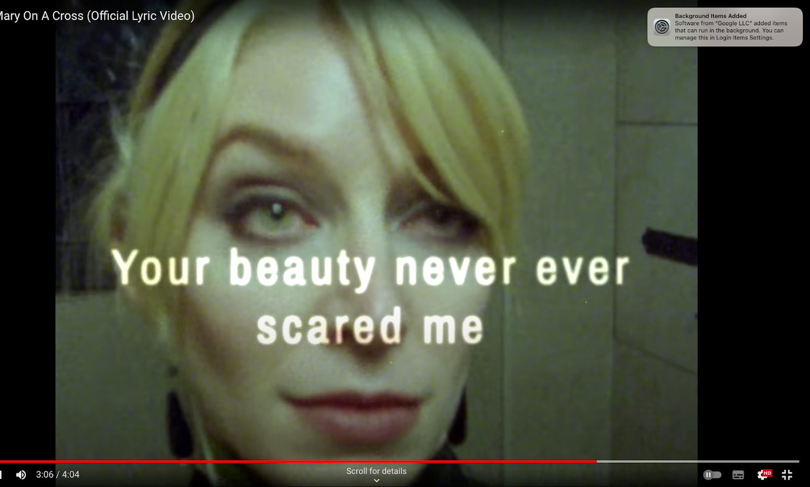


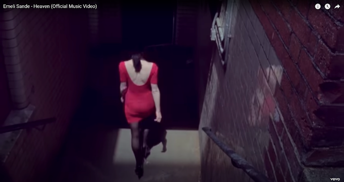


MV ANALYSIS:
ReplyDeleteGood notes and some excellent analysis. Well done!
MV INITIAL RESEARCH:
Good notes
MV CASE STUDY 1 NOTES:
ReplyDeleteSome great notes and insights. Well done. Make sure you link anything you notice to the meaning of the song.
MV CS1 REP Q:
WWW: excellent use of social context, supported by media language.
EBI: try including theory where relevant - e.g binary oppositions
MV CASE STUDY 2 NOTES:
Good - great ideas on intertextuality - make sure you link these to the CONTEXT.
MV EXAM Q:
WWW: excellent analysis with in depth examples and accurate terminology!
EBI: try linking some of these to either the context or the overall meaning of the song
ADVERTISING INTRO ANALYSIS:
A good start but you need to make sure you are linking the techniques used to the messages in the adverts.